September 26, 2022 / Marjoram
“You never get a second chance to make a first impression.”
Adam Grant, Even
Bad first impressions are difficult to overcome. Great ones, on the other hand, lay the foundation for meaningful, long-lasting, fruitful relationships.

For B2B industrial and ingredient brands, one of the best and most impactful opportunities to make a positive first impression is with the website homepage. We’ve mentioned previously that your corporate website — your flagship digital marketing instrument — is most effective when leveraged to promote your brand, create demand for your offerings, and generate leads for your sales funnel. That digital prospect experience starts the second a visitor lands on your homepage.
How well you’re able to shape and influence the initial first few seconds of that homepage experience determines how much more time you’re granted to continue building the relationship with your potential customers.
Research suggests that users frequently decide to leave a webpage after only 10-20 seconds, with the takeaway being:
“To gain several minutes of user attention, you must clearly communicate your value
proposition within 10 seconds.”
A few seconds. Sometimes, it’s even less than that.
Here are a few more head-turning web design statistics to consider:
- Some user opinions are formed in as quickly as 17 milliseconds
- It takes 2.6 seconds for users to visually observe the areas of the webpage that most influence their initial impression
- First impressions are 94% design-related
If a few seconds (at best) is all you have to make a positive impression on your potential customers, how do you pass that all-important first-look test? You ensure that your B2B corporate homepage is built to do its job.
The Ideal B2B Corporate Website Homepage Experience

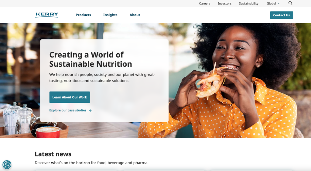
Your B2B website homepage has a simple job: to act as the digital welcome sign, or billboard, for your brand. Another way of saying that is, your website has to quickly prequalify your visitors. It must immediately tell them “You’re in the right place. This is the information you’re searching for.”
To do this job well, your B2B homepage design must follow a simple formula. It needs to answer four general questions for your visitors in as little amount of time as possible:
- What? — What does your brand do? What (big picture) problems does it solve?
- Who? — For whom is your brand solving the problem? (Your homepage has to convince your visitors/prospective customers that it is speaking directly to them.)
- Why? — Why should your visitors/prospective customers care about your brand and solutions?
- How? — How can your visitors/prospective customers get their hands on your solutions?
B2B brands that provide this information up front — with minimal effort on the part of the users to discern the answers — are able to extend their visitors’ journeys from the prospect stage to the buying process. But not all corporate websites are able to accomplish this goal. Where do B2B sites go wrong?
B2B Website Homepage Experiences That Fall Short

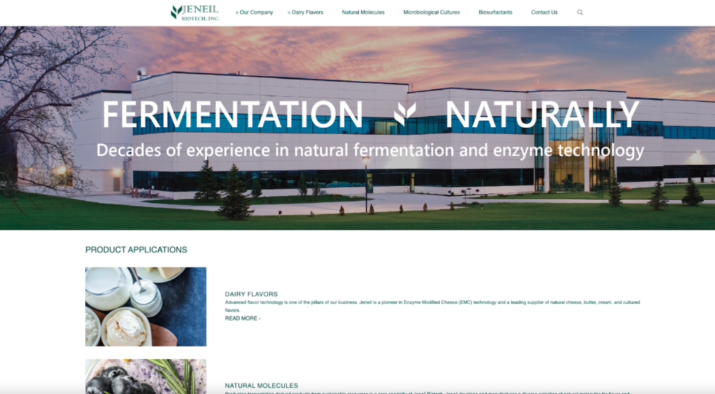
Often B2B industrial or ingredient brands forget that the homepage is for their prospects (and not their internal audiences). Instead of trying to answer the above four questions for visitors, many industrial and ingredient brands present their narratives through an inside-out lens.
Makers of complicated, sophisticated solutions prefer to shine the light on their expertise and technical know-how. Frequently, this is because the content that winds up on the homepage is spearheaded by brilliant engineering or technical company leaders.
However, by leaning heavily into internal plaudits or capabilities, these types of homepage experiences leave a gap between the searcher’s intent in selecting your site and the solutions they expect to discover. This approach assumes a base of knowledge (about the brand and/or products) that does not yet exist for users. As such, these digital prospect experiences skip a critical step in the customer consideration journey.

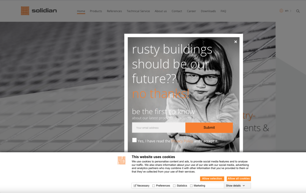
Confusion is another common obstacle that arises out of failure to prioritize user experience. In this example, site visitors are faced with not one, but two pop-up elements that require action before they are able to reach the homepage content. Furthermore, it’s uncertain if “rusty buildings” are, in fact, a common pain point for all site visitors. Regardless, this uncertainty remains unresolved even when users do get a glimpse of the homepage messaging, which invites them to “discover” solutions rather than presenting them upfront.
When visitors are faced with multiple barriers to entry (or understanding) and find themselves with more questions than answers, they rarely stick around long enough to digest your message.
Designing a B2B Homepage Experience for an Unforgettable First Impression
If a visitor is going to form an initial impression in a matter of seconds, it’s imperative that they gain the right one.
To design a B2B homepage experience that works for your brand, it’s important to trade that inside-out approach for an outside-in one. The outside-in approach focuses your efforts on your potential customers’ needs and challenges first. That way, when you do (eventually) speak about brand and products, you approach the conversation from the perspective of what you make possible for your customers — your solution to a market problem.
Finding the right perspective for this approach is often difficult for corporate B2B industrial or ingredient marketing teams who answer to numerous internal product stakeholders. In many cases, a trusted digital marketing partner can more accurately and efficiently gauge the needs of your B2B website in relation to your prospective customers.
At Marjoram, we often use the 10-second test to help our clients evaluate the performance of their corporate website homepages. Limited exposure to your brand’s expertise and solutions allows our “quick look” assessment to replicate the impressions your target audiences take away. If your homepage design, structure, content and messaging do not communicate to us what you do and for whom (when we’re looking for this information intentionally), the existing user experience is unlikely to do this job for your potential customers, either.
Your Corporate B2B Website Homepage Is For Your Customers, Not Your Brand
Industrial or ingredient brand homepages are often geared toward the wrong audience. Instead of leading with information important or interesting to prospective customers, they spend too much time talking about themselves.
If you want to establish more meaningful relationships with your prospective customers, start by optimizing the user experience on your corporate B2B homepage. Your prospects are less interested in how you make your products or the expertise that makes them possible. Your prospects just want to know about the things that your solutions make possible for them.
Does your B2B website pass the 10-second test? Don’t go too long without evaluating the impact of your key digital marketing assets. Marjoram helps industrial brands find marketing clarity. Let’s talk.
Fresh Perspectives
A newsletter we send every other Friday to share our ramblings, perspectives, thoughts, and rants on all things B2B branding, messaging and marketing.
"*" indicates required fields


