Going for Gold with an Olympic Brand
It’s that time again: when we all become experts in beach volleyball, gymnastics, synchronized swimming and for some of us, Olympic branding. The London 2012 Olympic Games began with a bang two weeks ago and has become—contrary to NBC’s best efforts—the most watched Olympic Games ever with more than 35 million viewers tuning in the first weekend. This massive audience makes the Olympic identity one of the world’s most viewed brands over the 17-day Games.
So what makes a good Olympic identity? In our opinion, a memorable Olympic logo has three basic qualities:
1. It visually represents the culture of the host city or country
2. It gives a good representation of the games themselves
3. It communicates simply while maintaining a sense of energy
The London Olympics logo falls short on each of these qualities. Nothing about this year’s mark seems to be tied to the host or the Games (save the actual Olympic rings). The idea that it represents “2012” has also received a lot of criticism because the numerical shapes are too complex and left wide open to interpretation—none of it favorable. The logo NBC is using for their coverage does a much better job representing the host city and nation.
So how does the 2012 mark stack up against logos from past Games? We’ve assembled an expert panel of judges from Marjoram Creative to review the Olympic logos from the past 100 years and, in true Olympic spirit, they’ve awarded a Gold, Silver and Bronze medal to the top three.
Drum roll, please:
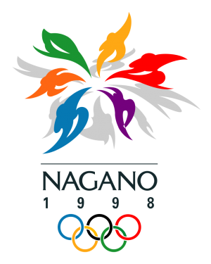
In the Bronze position: Nagano 1998

The Nagano logo checked a lot of boxes for our panel of experts. The design shows human figures in various states of athletic activity while the shape represents a “snow flower.” It’s simple, colorful, and represents both the host and the winter season well.
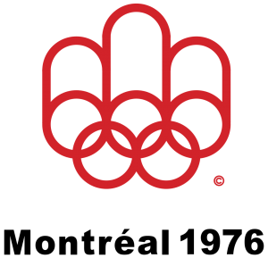
In the Silver position: Montreal 1976

This throwback logo from the Montreal Games really resonated with our judges. The “less-is-definitely-more” mark was created from the Olympic rings, the winners’ podium, the letter M, and a running track. The entire identity of the Games followed this simple design that conjured visuals of the host city itself.
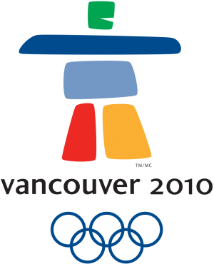
And…the Gold medal winner is: Vancouver 2010

The Vancouver logo received top marks from our panel. It is simple, colorful, and uses a human figure based on an ancient inukshuk to represent both the host and the Games very well. (An inukshuk is a stack of stones traditionally used as a route marker by the Inuit people of the Canadian arctic.)


